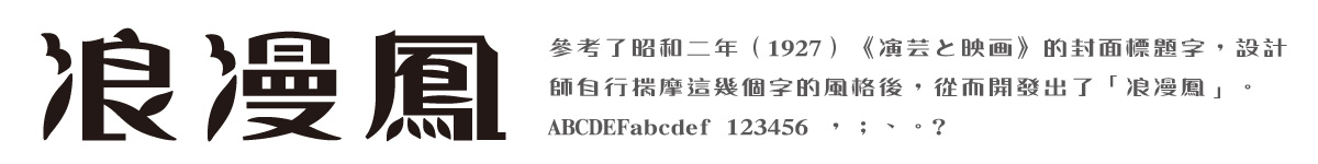
Dynafont Art Fonts: LangMan Feng font
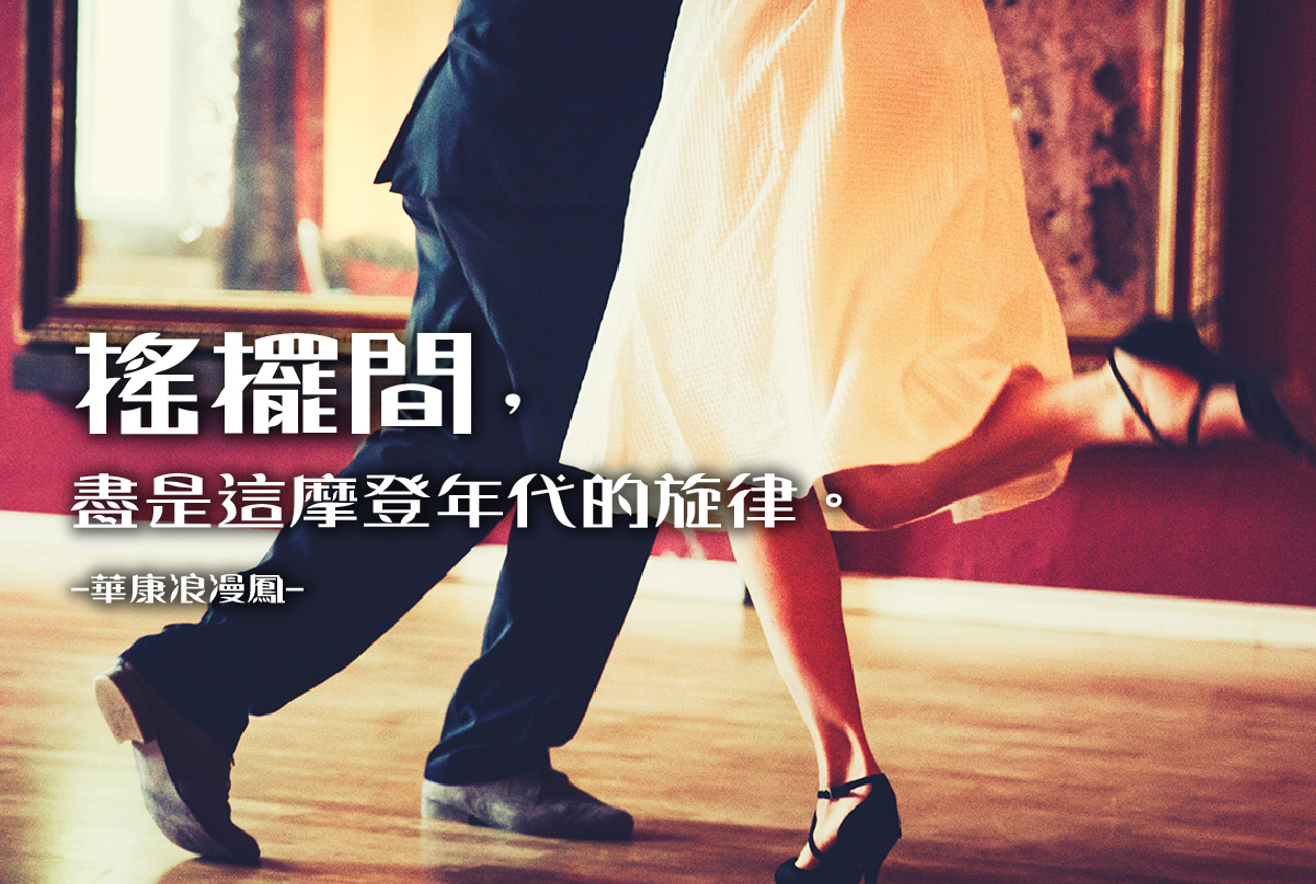
Let's dance you and I!
The romance of free love spreads across the city.
In the street and on the road, there are modern girls
in dresses and umbrellas everywhere.
Dotted, floral, lace…each reflects their personality
As self-confident as the atmosphere of the times.
The Romantic Series with a strong vintage flavor is the main character of this font story. Its gorgeous decorations recall us to the glorious past. Let us follow the pace of fonts to recall to the old-schooled literary youth!
A time of fashion and romance
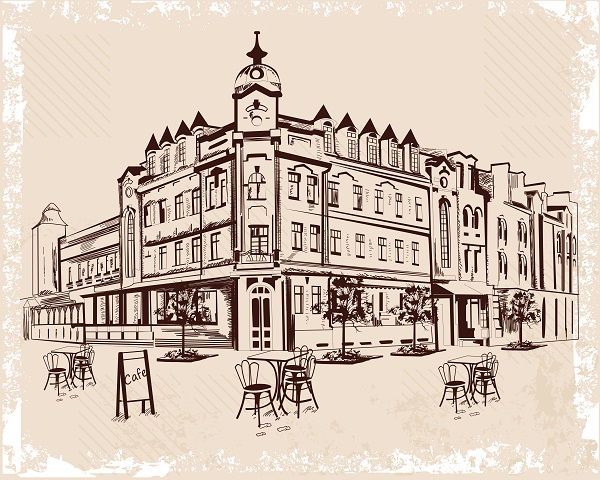
Westernization started in the Meiji period has radically changed Japanese society in the 1920-30s. Traditional townhouses disappeared down the streets of Tokyo, and modern urban buildings, public space, and orderly planned transport systems arose. While shopping, going to movies, and having coffee on weekends became the most fashionable entertainments, listening to pop songs and reading magazines were the favorite pastimes. To become modern was the most fashionable trend in the city, and modernization of society began to take place in Japan.
Attractive Decorative Scripts
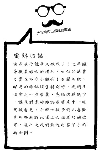
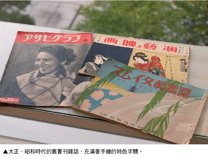
The magazine corner was particularly attractive. There were magazines for children, geisha photo albums for men, and fashion guide for modern girls and young wives. While appearance design became an ideal solution to quickly attract readers in the highly competitive reading market, decorative hand-written titles arose by leaps and bounds.
The Romantic Series – Reprinting Romance
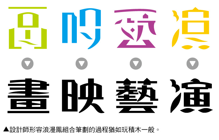
Stroke by stroke for LangMan Feng font
Usage
Each set of the Romantic Series is characterized by its decorative appearance. The series is fit for the titles and subtitles of newspapers, magazines, and publicity materials or the titles of CD covers, LP covers, and posters.
Features of LangMan Feng font
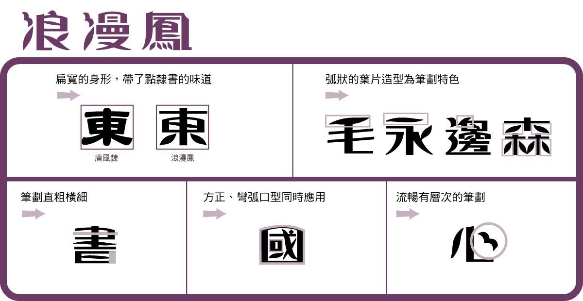
Examples of the features of LangMan Feng:
Designer Insights
★ The Romantic Series is fit for use on titles, what are the differences from designing fonts for use in the body?
Designer: “Legibility” is the prime concern of body fonts. Readers must be able to get the message expressed by the text without spending extra time on identifying the characters. For example, Ming script is very common in text. The triangular head design on the font’s right hand side links characters on the right for readers to naturally read from left to right. By contrast, “legibility” is less concerned with title fonts such as the Romantic Series, which emphasizes the purpose of design for designers to spend more time and energy on the complexity and feature of stroke design.
DF LangMan Feng font introduced in this article is available for annual licensing DynaFont Treasure. More Information