DynaFont Calligraphy Fonts: DF JinWen Font
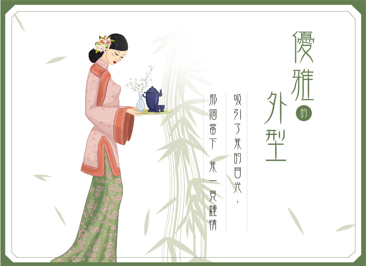
A silent encounter.
It is the start of an emotion and a romantic aspiration.
Suddenly, it seizes our heart. It is called “love at first sight”.
What can make a designer fall in love with at the first sight then?
Are you ready to feel what it's like? Let's unveil this font!
Touch of the beauty of classic scripts
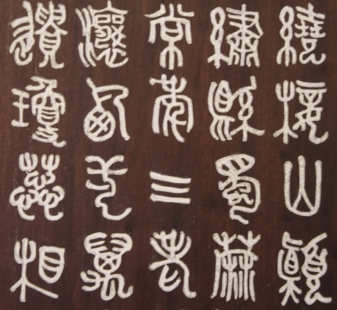
▲中國先秦古文字
Features of DynaFont JinWen font
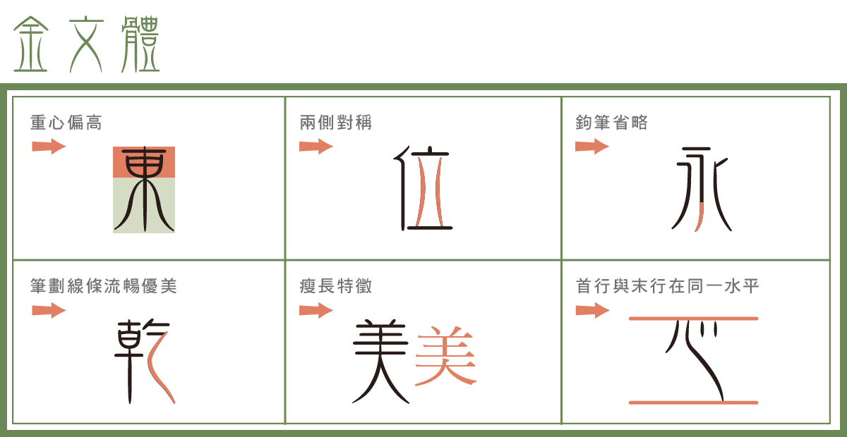
▼Examples of JinWen font:
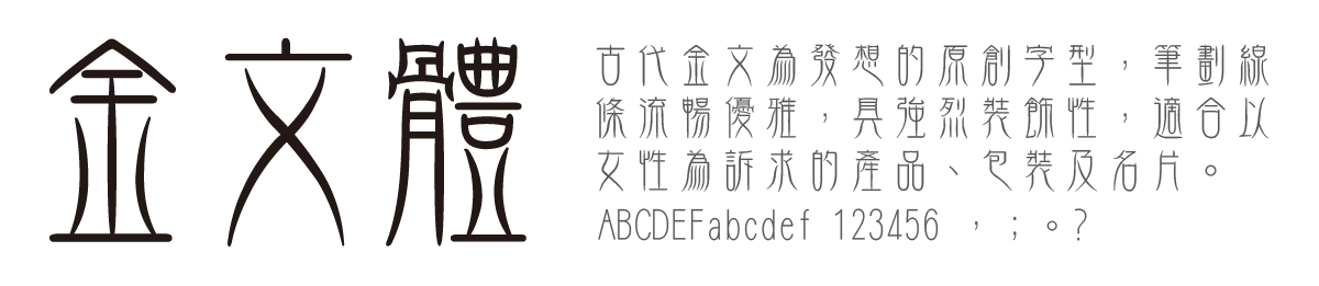
Usage
Tall and slender, JinWen has a strong decoration feature suitable for use on products, packages, and business cards for women. It is also suitable for use in publications with an Eastern style.
Designer's Insights
Q: Instead of following the rules of ancient bronze script, why did you create a new style of your own?
D: Because JinWen is not designed for the academic purposes. If I followed the rules of ancient bronze script, no modern people could recognize it, and it would be useless.
Q: What was the biggest challenge in the design process?
D: The biggest challenges fall into two aspects: first, there was no reference for an original design; and second, the control between “legibility” and “originality”.
Q: If you wish to hire an ancient beauty as the endorser for the font, who would you choose?
D: Anyone with 1:9 proportions, elegant and delicate will do.
Q: What style of fonts you would like to challenge in the future?
D: If there are chances, I would try brand-new fonts suitable for use on small screens (smiling).
More Information