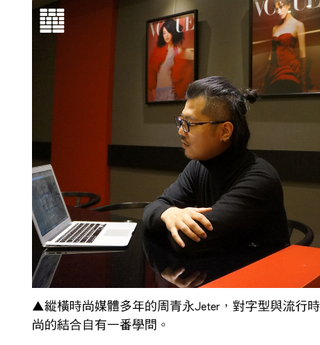
Walking through the door of GQ and VOGUE in Taiwan, the visitor is greeted with an atmosphere of glamor. A bright eye-catching red immediately lures the attention while the arrangement of black and red creates an air of magnificence and elegance. The covers of fashion magazines lined up on the wall show the dazzling splendor of celebrities. Are fonts merely a supporting role next to the spotlight? The answer is no. Brands with longer histories have fonts with unique charm. This DynaFont story takes us to an interview with Jeter, the deputy director of digital design at CondeNast Taiwan for a trip through Taiwan’s fashions media industry to learn about the font aesthetics of fashion media. Fonts with Sophistication.
Fonts with Sophistication
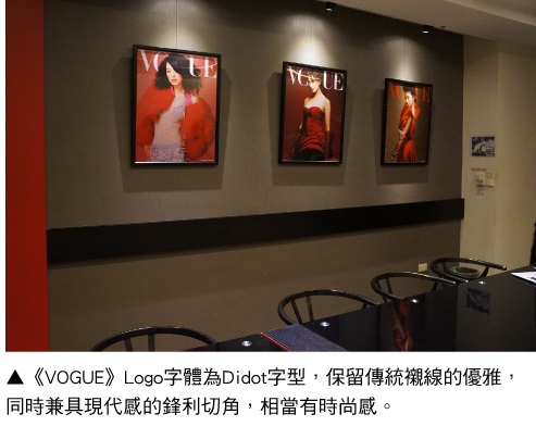
The Didot font, which is used by VOGUE, a magazine that has led the fashion industry for more than a century, preserves the elegance of traditional serif while combining it with the modern sharp corners. The lines of the fonts are expressed with extremely thin and thick strokes that gracefully annotate the required elements of a fashion font. GQ, which focuses on men's fashion and lifestyle, developed the Gotham font for the overall style of the magazine. The sans-serif of geometric structures emphasizes the display of details, displaying a smooth and masculine brand impression.
Compared with VOGUE and GQ in other countries that develop their own exclusive fonts, Jeter stated that he looks forward to a day when VOGUE will be capable of creating exclusive Chinese fonts. We cannot help but wonder what would a VOGUE-exclusive font look like? “I think it would be similar to the standard font that I created for “Coming into Fashion” photography exhibition (Taiwan area), only stronger. When designing the two Chinese characters “預” and “見” (the Chinese title for the exhibition), the rounded edges of the connecting strokes give a classic style. If I am to re-design a font for VOGUE, I will strike out the more decorative parts.”
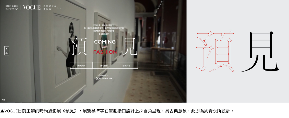
With many years of experience in the industry, Jeter mainly provides for the needs of GQ and VOGUE's digital design on the editorial and marketing end. In November 2016, DynaComware and VOGUE collaborated in creating the products and official website of “Coming into Fashion VOGUE Fashion Photography Exhibition” (the website won the international CSS Design Awards 2016 Special Kudos award), Jeter's recent masterpiece. Looking back at the exhibition, the minimalist and sleek Hei font create an elegant exhibition environment. As for the official website, the squared Hei font for screens, which was specifically designed for the screen, allows a comfortable reading experience and recognizability. The graceful lines and clear structures provide a fashionable atmosphere while browsing the web page for information.
When fonts emerge to the cloud
Speaking of the difference between digital and graphic design, Jeter believes that screen fonts require higher standards in readability. “For instance, the content of VOGUE magazine is the Ming font, however, on screen, the thin horizontal strokes of Ming fonts lead to bad reading experiences. Therefore, the fonts on the website are replaced with Hei fonts, which provide a more comfortable reading experience.” When fonts emerge on the platform of fashion media, designers must face the task of breaking through limitations in products and technologies to present high-quality readability and aesthetics throughout different devices. Jeter stated: “The task lies in creating uncompromising results while compromising to limitations of the surrounding environment.”
Perhaps this uncompromising attitude is key to leading the trend in fashion and creating timeless aesthetics.