DF Kang
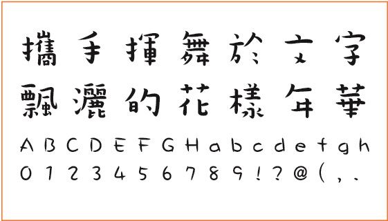
DF Kang uses KaiShu strokes. If it was a person, it would never do things by the book. Its biggest feature lies in its disproportionate head/feet weight and size. Everything about DF Kang may seem in conflict, and yet it exudes an audacious exuberant vitality.
【Creative Concept】
DF Kang resides in conflicting aesthetics, where square and angular KaiShu strokes come as extra striking for its irregular structure against common expectations. It’s as if two sets of seemingly stark different rhythms fuse as one melody that are surprisingly in sync with each other.
【Screenshot Layout】
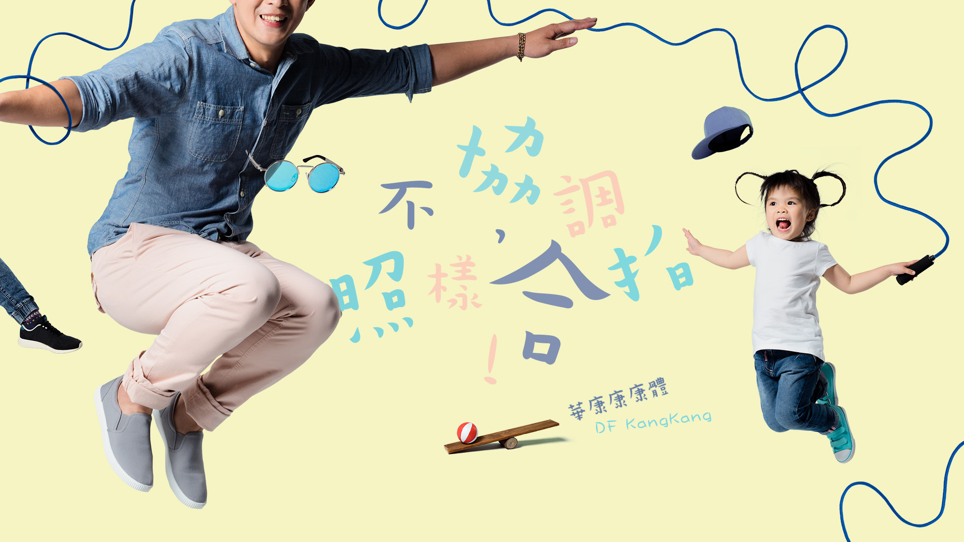
It's much like an encounter of two separate souls within the frame of a word font. DF Kang gets attention for its lack of coordination and stands out with certain flair. A child and an adult are selected to embody the spirits of the font by having them leap in the air. Added to the leaping duo and their jump rope are special elements like the sea-saw and a hat that is flying into the air, in order for the static screenshot to be charged with dynamics.
【Notes from the Frontline】
DF Kang is unique for its uncoordinated aesthetics. The choice of having a dynamic duo of a leaping adult and child conveys the spirit behind what starts as uncoordinated ends up in sync.
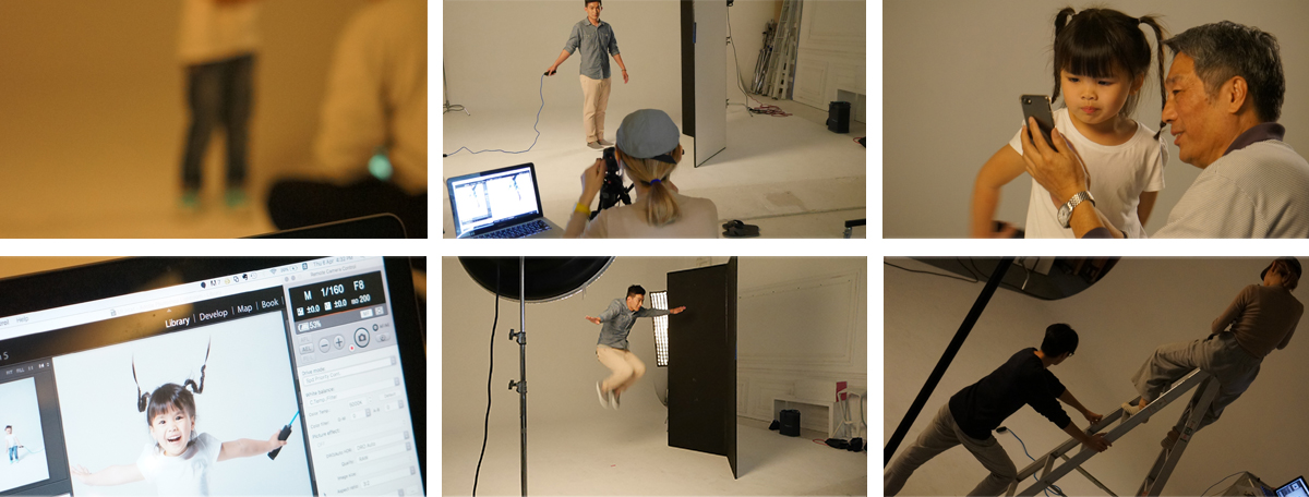
The adult, for his smooth movement execution, was easy to shoot. We captured that dynamic essence after just a few attempts. The child, on the other hand, was a worry for the camera team. It was not our first time shooting children but out first attempt at capturing that sense of dynamics in a child.
The little girl walked in the studio with her grandpa. Her cute face won us over immediately. She was a bit shy to begin with, but with Grandpa’s encouragement, she just kept on jumping. The director successfully captured those fleeting moments when the little girl was in the air, with her bouncing plaits and perfect facial expression. What we thought to be most challenging turned out really smooth. The director shrieked, “Perfect!”
Though filmed separately, the shots come together nicely much like the stance of the DF Kang!
Type: Art Font
Thickness: W5
This is a wacky font that will surprise you when you least expect it. It features a disproportionate layout for its strokes, containing the solid and full-bodied traits of the KaiShu font. It’s suitable for prints of books, newspapers, magazines, comic books and product packaging.